How to set up your account branding: colors and logos
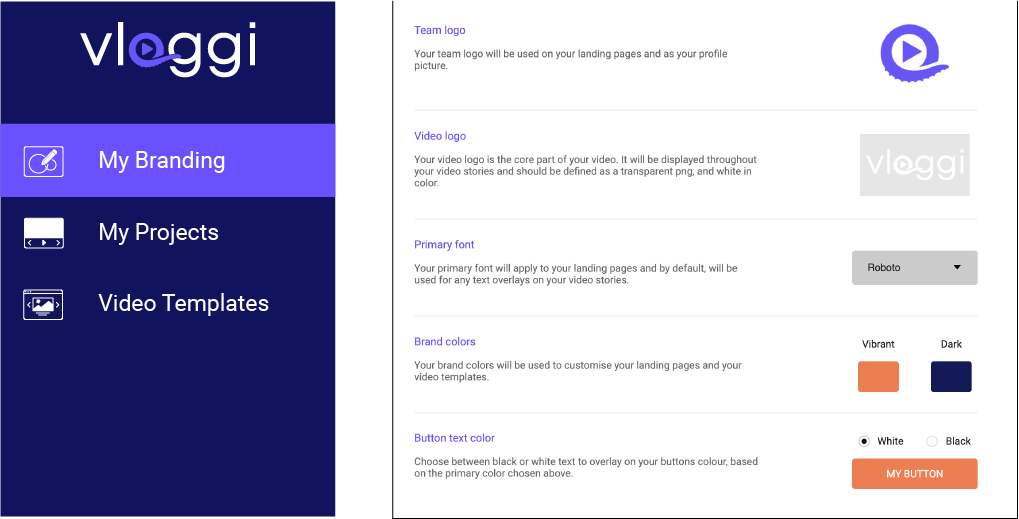
We recommend setting up your brand assets (colors, fonts and logos) right at the start, as one of the first things you do in the Vloggi Platform. You can do this by clicking on the 'my branding' tab in the main left side navigation bar

-
Team logo vs Video Logo
- Your team logo is the icon used to identify your project to contributors. It will appear in the two places listed below. We recommend Jpegs of 225 x 225px resolution)
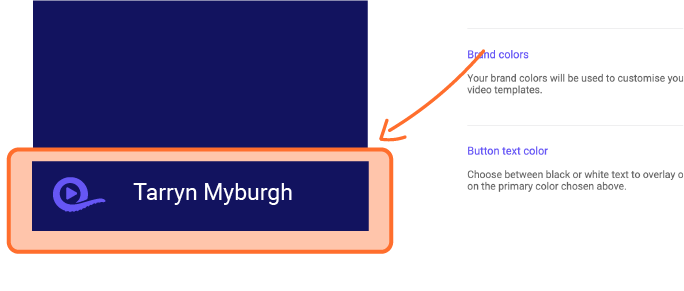
- Your account icon

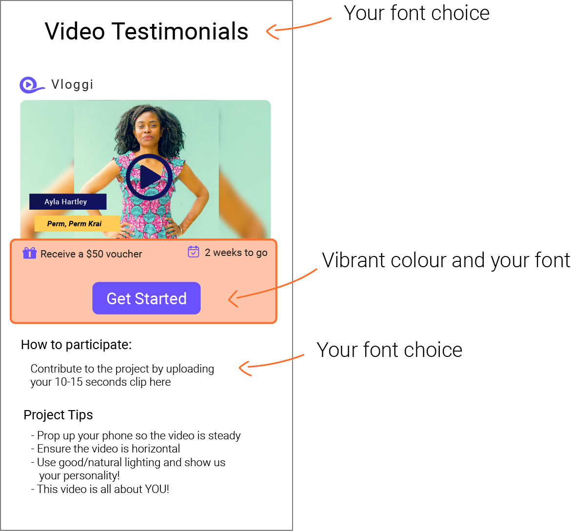
- On your upload landing page

-
- Your video logo is a watermark that will appear on the video clips, as well as the intros and outros. You can customise or remove this at any time, as well as uploading images for different logos.
We recommend a white-out version of your logo as a transparent PNG at 400 x 225px resolution.
-
Colors and fonts
Your colors and the fonts you choose will be automatically applied to your landing page copy, video template fonts and button colours. The 'vibrant' color is usually your brand's primary color and will be used as your button color on the landing page your contributors see. The 'dark' color is your secondary color applied automatically to elements in the video templates.

